|
Dear Illinois Tollway: Hire New Graphic Designers |
|
Posted Jan 23, 2012 - 8:49:45
|
|
 So this weekend I was in Milwaukee, and like all of the times I travel up to Wisconsin from my current home in Indiana, I take the Tollway through Chicago (as it saves quite a bit of time, and frankly with my IPASS I forget I'm paying tolls). This month the tolls on said freeway were raised dramatically, and to inform motorists a series of signs and banners began to appear in Oasis buildings that span this network of roads. I, of course, found this incredibly annoying.
The banners themselves that is, not the toll increases.
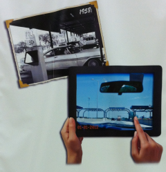
One of the banners which has been adorning spare wall space in Oasis after Oasis is this particular display. It features two photos, one to represent the Tollway in 1958 and the other 2012. 1958's is, of course, displayed as a photo in an album. 2012's is... on a generic tablet of some sort? The 1958 image is fine, but that "current" image gives me pause.
See, there are several problems with it. Let's put aside the annoying disappearing hands which I guess are needed to show that it's meant to be a tablet (otherwise it would just look like a black frame - but try holding a tablet like that, not super comfortable). In the lower left hand corner, we have this:
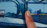
While the 1958 picture got a nice font, 2012 gets... a digital time read out from the 1980s? I don't know what it's supposed to be, honestly. Is the digital photo displayed on the tablet supposed to have that embedded in it? Is it part of the tablet's operating system? Neither makes sense, as no digital camera would embed the date like that (or at least in that font), nor would a tablet need to use such an old-style digital readout as part of its operating system.
It's like someone's idea of the future was locked into 1987, but had to paste the image into an iPad-like device at the last minute.
Secondly, the 1-1-2012 (while obviously in reference to the date the tolls changed) doesn't make sense with the context of the picture. You'd think they'd at least get a winter scene for the ad (or leave off of the January date) when I can clearly see trees with thick, green foliage in the image.

Not very convincing guys... And in the end, I'm left wondering why someone thought it might be a good idea to show a picture that must have been taken by someone
driving the tollway... especially when next to another banner talking about the dangers of distracted driving.
I have to say this entire thing looks like it was thrown together by a hack - and I'm left with the following conclusion: The Illinois Tollway needs to hire a new graphic designer.
- Traegorn


