|
The Frustrations of Print | |
Posted Feb 6, 2012 - 12:34:13
|
|
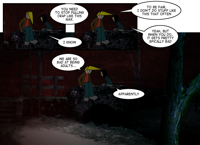 So I got the first proof for the second UnCONventional Chapter Two this weekend. There are always unforeseen hiccups that can happen when transitioning the comics from web to print, and the second chapter has proven to be no exception. So I got the first proof for the second UnCONventional Chapter Two this weekend. There are always unforeseen hiccups that can happen when transitioning the comics from web to print, and the second chapter has proven to be no exception.
Chapter One went pretty smoothly, as that first book was entirely black and white. The only real issues when I was putting that together were some issues with the cover on the first proof copy. Chapter Two though, especially with the full color "I Hate November" portion has given me a bit of a headache.
My design background with color has been almost entirely screen based over the years -- it's what I've studied, it's what I know. I've never had any formal training when it comes to designing for print, and each time I do something, there's a bit of guesswork (and a whole lot of learning as I go) involved.
My first proof when I do a book is what I call the "lazy version." It's where I cross my fingers and hope everything works without adjustments. It's risky, but since I know the only person who will see the results is myself, I just do it.
The color in seven or so strips in I Hate November are quite dark though, and while they show up nicely on screen... the panels are effectively black when transitioned into print.
Which if I knew anything about printing color, I probably would have figured would happen.
So, now I need to create some higher contrast, brighter versions of the strips. It's hard to judge, as I still need the comics to look like they take place outside at night, so they need to be dark still... so I'm guessing. I'll redo the strips, order a new proof, and see how things go.
Geh.
- Traegorn
|
|
|


